Say goodbye to beige
When Deborah Nicholson walked into her client’s home in Hammonds Plains, Nova Scotia, she was greeted with a blank canvas that would be inspired by the grandeur of traditional Tuscan style and the homeowner’s personal joie de vivre. It was a design match made in heaven for Nicholson, who uses colour as her love language, and her client who had a desire to transform the subdued narrative of the existing décor story.
While colour was big in the scheme, the primary objective was to cozy up the large rooms and bring a more human scale to the abundant square footage without making any structural changes. A master with the colour wheel and drawing on her past career as a lighting designer, Nicholson started to create a palette that would reveal a new perspective with punches of paint and pattern throughout the 5,000-square-foot home.
“Everything in the home was painted beige, which was right for the time for when the home was built,” says Nicholson of the house that was one of the first properties to be developed in the residential golf community of Glen Arbour in the late 1990s.
“The rooms were large, and everything felt oversized and uncomfortable. It’s hard to settle into spaces that feel this way. In design we often hear that a client wants to make their space feel bigger and more open but there is also the case when big loses its appeal and it needs to feel cozier, more comfortable.
I always decorate from a place of making a space feel livable. When certain elements are off, that’s what makes us feel uncomfortable, but we don’t always understand why,” she explains.
While Nicholson sees the appeal of monochromatic style, she believes that there needs to be contrast; and while an all-white house looks lovely in a magazine, these spaces can be difficult to live in.
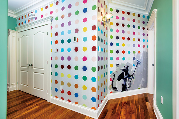
The most fun that designer and client had was the placing of whimsical Banksy art decal wallpaper in a hallway.
“There needs to be contrast. We need to have lights and darks and something in the middle,” say Nicholson.
Saying that she can spend days with colour swatches and has her own personal favourite colours, she is most excited about creating colour pairings. And while most would think the first question a decorator would ask their client would be to list their favourite colours, she says the query is usually the kiss of death for any colour exploration.
“As soon as you name a colour, it has a whole history, so I never ask my clients what colour they love; but I do ask them to show me something that they have that they absolutely love the colour of. That’s a great way to start. If I walk into someone’s kitchen and tell them I think they should paint it orange, most often they would give me an immediate no but if I bring them colour combinations and patterns, that changes everything,” she says.
Through a little discovery, Nicholson and her client landed on shades of green for the home’s new neutral.
“A neutral doesn’t have to be beige—it can be any colour that you carry throughout your floor plan,” she says.
Nicholson started in the living room where elegant 10-foot trayed ceilings were treated with a beautiful, saturated green, drawing the eye down and making the space more intimate. This also allowed the ceiling moldings to become more defined elements of the architecture.
Nicholson and her client landed on green for its soothing value.
“Green is nurturing and a comforting colour to be around. It’s restorative, just like when you are outside and connecting to the natural world.”
Colour is making a huge come back in design. While it was trending prior to 2020, the impact of the pandemic has made colour more aspirational in design, as people spend more time in their homes and desire more imaginative places.
“Since the pandemic we have realized that we need to be nurtured in our homes, really a safe haven from the world; but our homes are the places that can be playful and a place where we can really express ourselves.
“Beigeification,” became one of the hottest trends in home décor in the late 90s and early 2000s. Nicholson believes that this is in part due to the departure from using some of the more “riotous” colours of the 1970s and ’80s, but there was also something else at play. There was a whole new generation of homeowners that were picking up on the real estate flip. If homes had a beige neutral palette and every piece of furnishing in the home aligned, then it would be more appealing to prospective buyers who could “see themselves in these spaces.” The trend was espoused on home décor channels and websites.
Designers like Nicholson are happy that those days are gone, and that home buyers today are looking for anything but drab. Some decorators will say that the beige era is one of the most interesting design eras to study, simply because it was void of anything tremendously interesting.
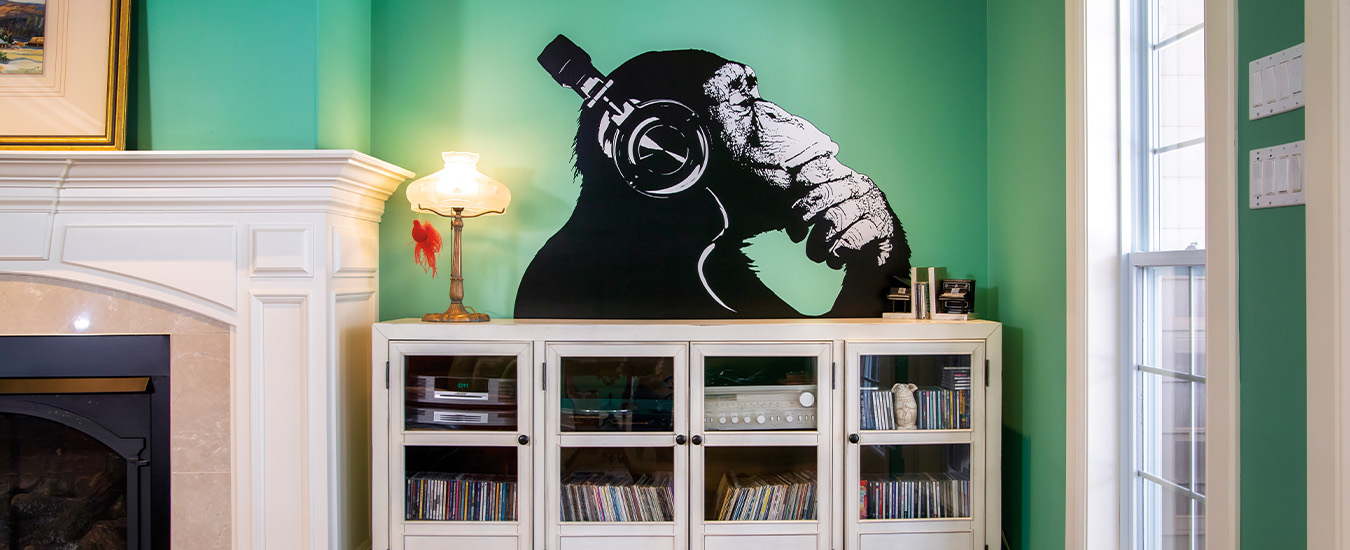
Nicholson, who is based in Canning, NS and works with clients throughout much of Nova Scotia and southern New Brunswick, says that the Glen Arbour house is a perfect example of how colour can transform. The beige that had swallowed some of the most elegant features of the home disappeared behind lush greens, corals, purples and pinks. There was mindful treatment of trim colour that either helped ground a space or draw the eye up. They also incorporated patterns with large botanical prints. Perhaps the most fun that they had was the placement of Banksy art decal wallpaper in a hallway where a rat appears to be painting polka dots down the length of the hall. A decal of a chimp wearing headphones define the stereo cabinet in the living room. Both applications break the barriers of what is determined as safe in traditional Tuscan-style home.
“In this project we used a lot of the owner’s own furnishings and décor objects that were tucked away,” Nicholson says. “She had a magnificent sofa that once belonged to her grandmother. As it was it was very uncomfortable to sit on; but we found a great furniture restorer who put new padding inside, we covered it in a delicious velvet named orange crush and it was perfect. It’s pieces like this that tell our story and that is so important with home décor.
“I think that when people make what they think is a safe choice and don’t choose the colour, it’s pretty much like making a choice between that delicious chocolate cake and a piece of celery, says Nicholson. “But we all know that if you choose the celery, you are always going to be thinking about the cake!”
Colour tips from Deborah
Q: You talk a lot about colour value; can you explain what that is?
DN: The values of a colour are the lightness and darkness of the colour. A light colour has a high value and a dark colour has a low value.
Q: You used darker colours to make this space feel cozier and more defined. Do darker colours always make a space feel smaller?
DN: Colour is relative. What it is paired with is what gives it its superpower. Most will think if you have a living room and paint it a light colour, it will make it feel bigger; and if you paint it dark it will feel smaller, but that is not always the case. The sheen on the paint has a lot to do with it.
Q: How does the sheen make a difference?
DN: It is all about the reflection of light. if you did a dark colour on a wall but did it in a gloss or a satin, light would be reflecting on it so you would get more of a sense of where that wall is. If it was a smaller room and it was all shiny, it would seem even smaller, but if you choose a matte finish, then it actually helps push the walls out. You can’t really tell where the wall is because it is not really reflecting light the same way. So, a dark colour can work well in a small space, depending on the sheen.
Q: How do your clients feel after they decide to be a little bolder with their colour choices?
DN: People are being more authentic with themselves and are not as fearful about their décor at time when the world might seem a little scarier. When people have choices, they feel empowered; and choosing colour can be very empowering.